Posted November 18, 2024
By Sean Ring
How to Read Candlestick Charts
Before we get into the charts, I would like to say that today, I would’ve written about yesterday’s idiotic decision by the Biden administration to allow Ukraine to use US long-range missiles in its fight with Russia.
Hopefully, someone with a brain in DC will stop this nonsense, or we’ll all be glowing in the dark soon. As details are scarce, I decided to keep my promise of doing candlestick charts today. At least we can go to our maker with more knowledge than before.
I will only cover a few concepts, so I don’t overload you in one sitting. They will be the candlesticks, using moving averages to discern trends and support and resistance levels.
Without further ado, let’s get you started on reading charts.
Who Invented Candlestick Charts?
Candlestick charts originated in Japan during the 18th century and were developed by rice trader Munehisa Homma. Homma used these charts to analyze market trends and traders' emotional states, identifying patterns to predict price movements. His method, combining price action with psychological insights, laid the groundwork for modern technical analysis.
Candlestick charts were introduced to the Western world in the late 20th century, popularized by Steve Nison's book Japanese Candlestick Charting Techniques. Today, they are widely used in financial markets to analyze price data and identify trends, reversals, and patterns.
How Do You Read Candlesticks?
Candlesticks are easy to read. Here are two generic candlesticks, one for an up period and one for a down period. (A candlestick can represent any time frame.)
Let’s start with the candle's shape. The “box” part is called the body, and the lines above and below are called the wicks (or shadows).
The body represents the period's opening and closing prices, while the wicks represent the period's high and low.
Those numbers I’ve put between the above candles are for illustrative purposes only.
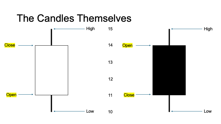
Let’s imagine this scenario for the left candle: The market opened at 11 and meandered down to 10, the period’s low. Then, the stock rallied a whopping 50% to 15 on news of an FDA approval for one of its drugs before cooling off and closing at 14. The candle is white because the close is higher than the open for the period. In charting software, these candles are sometimes green.
Let’s imagine this scenario for the right candle: The market opened at 14. Then it rose a bit to 15, the period’s high. Suddenly, it fell over 33% to 10, before rallying 10% to close at 11. This candle is black because the close is lower than the open. In some charting software, these candles are red.
But not all candles are this symmetrical.
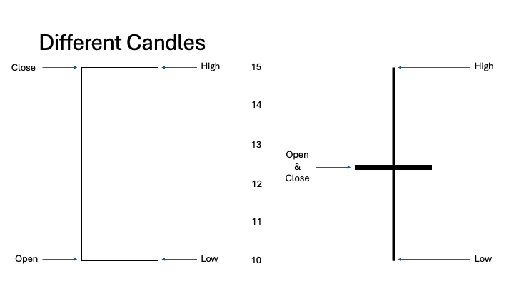
The candlestick on the left is a marubozu. That’s a candlestick with no wicks.
A bullish marubozu, like the one on the left, has no wicks on either end, indicating that the price opened at its lowest point and closed at its highest point for the period, reflecting strong buying pressure.
On a bearish marubozu (not shown), the price opened at its highest and closed at its lowest, reflecting strong selling pressure.
Marubozus signify decisive market momentum in the direction of the candle's body.
The candlestick on the right is a doji.
A doji is a candlestick pattern that forms when a security's open and close prices are virtually the same (or very near). It creates a candle with a very small or non-existent body and wicks of varying lengths.
Doji candles indicate indecision in the market, where neither buyers nor sellers have control. The context within a trend is essential for interpreting it:
- Neutral Doji (above): This signifies a balanced market.
- Long-Legged Doji: Indicates significant price volatility but no decisive direction.
- Dragonfly Doji: Has a long lower wick and no (or very short) upper wick, suggesting potential bullish reversals.
- Gravestone Doji: Has a long upper wick and no (or very short) lower wick, suggesting potential bearish reversals.
Doji patterns often signal potential reversals or consolidation, depending on their position within a trend.
Next, let’s turn to trends.
How Do You Discern Trend?
We use moving averages and candlesticks to discern trends. First, when the candlesticks move from the lower left of the chart to the upper right, it’s a bull market.
When the candlesticks move from the upper left to the lower right of the chart, it’s in a bear market.
Next, let’s define moving averages.
A moving average (MA) is a tool that smooths out price data over a specific period to help identify trends by filtering out short-term fluctuations. It calculates the average of a security's prices (usually closing prices) over a chosen number of periods and is plotted as a continuous line on a price chart.
A Simple Moving Average (SMA) is the arithmetic average of prices over a specified number of periods.
An Exponential Moving Average (EMA) gives more weight to recent prices, making it more responsive to new data. Its formula includes a smoothing factor that emphasizes recent data points.
For today, we’ll just use SMAs. The two most common MAs for stock trends are 50- and 200-day SMAs.
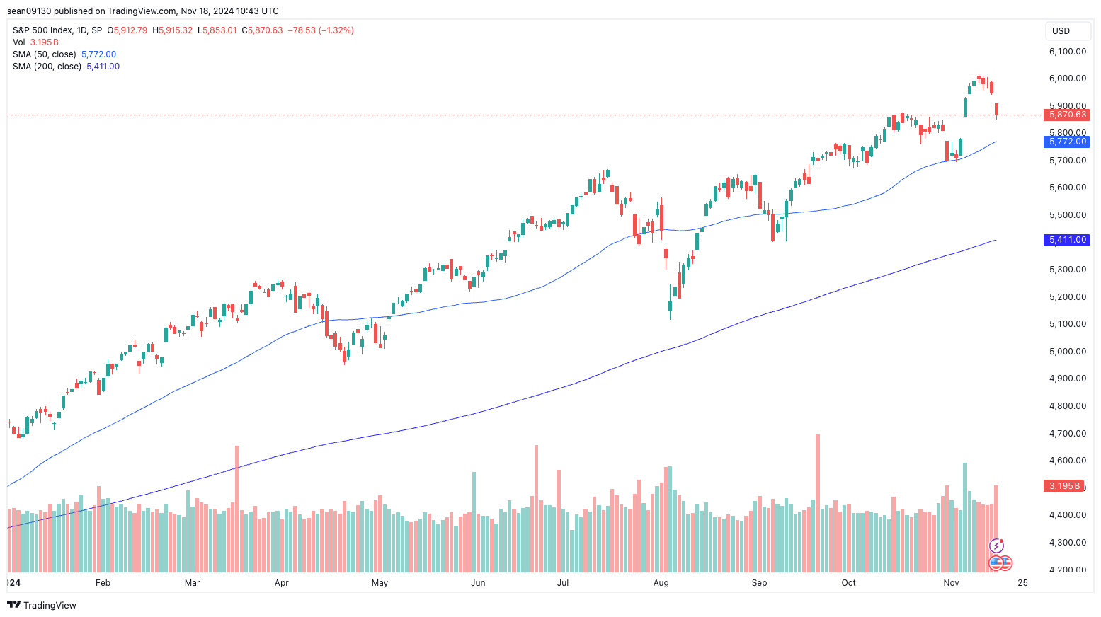
This is the S&P 500 Index as of Friday. The candlesticks (price) are above the 50-day moving average, and the 50-day moving average is above the 200-day moving average. Sure, we had three times on this chart when the price dipped below the 50-day moving average, but they were short-lived. Clearly, we’re in a bull market.
With gold, it’s now slightly different.
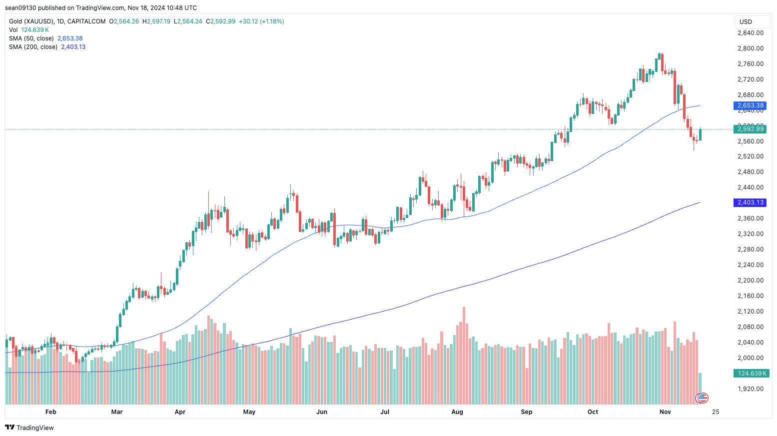
Although the price has recently been hammered below the 50-day moving average (MA), it’s still above the 200-day MA. So, we can say gold is in a short-term bear market but still in a long-term bull market.
As for NVTS, it’s not so lucky.
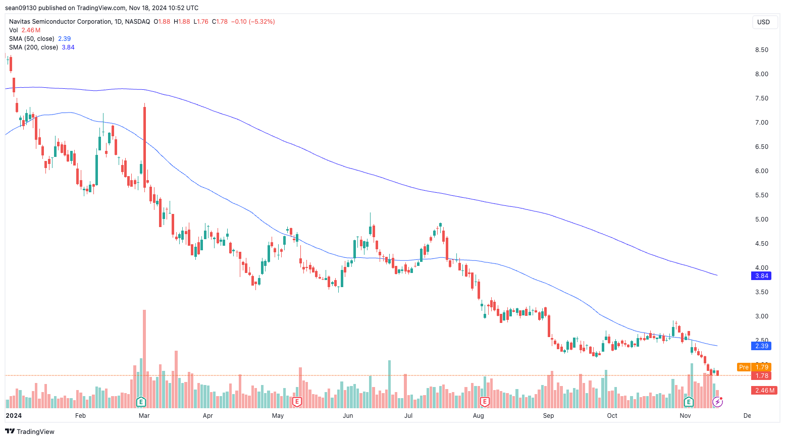
This chart is crystal clear but uglier than a blind carpenter’s thumb. The price is below the 50-day moving average, which is below the 200-day MA. This may be a good company, but it’s a terrible stock to own now. Clearly, it’s in a bear market.
Finally, sometimes we don’t trend at all.
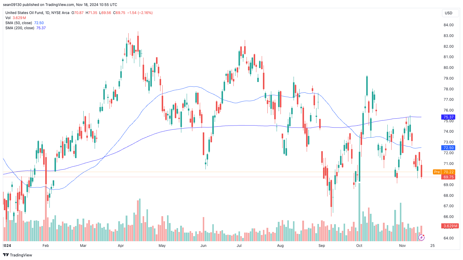
USO, the oil fund, is trending “sideways.” That means it’s either flatlining or rangebound.
Let’s move to support and resistance levels.
What Are Support and Resistance Levels?
Support levels are price levels where demand is strong enough to prevent the price from falling further. Buyers step in at this level, creating upward pressure to stabilize or reverse the price decline. It acts as a "floor" for the price.
Resistance levels are price levels where selling pressure is strong enough to prevent the price from rising further. It acts as a "ceiling" for the price. Sellers dominate at this level, creating downward pressure that halts or reverses a price increase.
It’s important to note that moving averages can act as dynamic support or resistance levels.
Let’s look at a couple of examples.
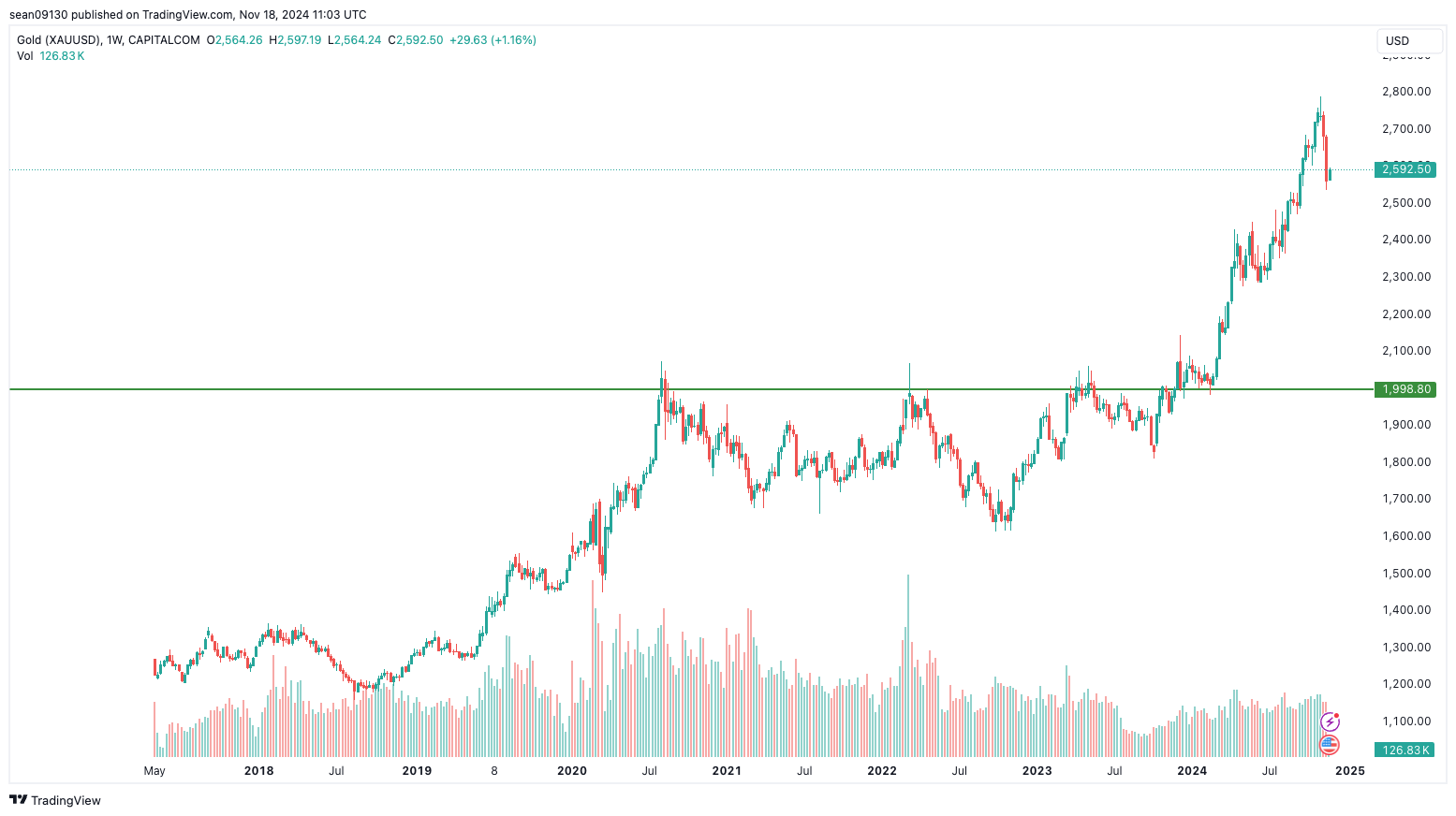
Remember when I wrote about gold bumping its head on the $2,000 level? It happened three times before it finally broke through that level definitively. That’s because $2,000 was a massive resistance level, as there was a load of “overhead supply” at that price.
Then, there was a “reverse of polarity,” where $2,000 turned from resistance into support.
And how’s this for a support level?
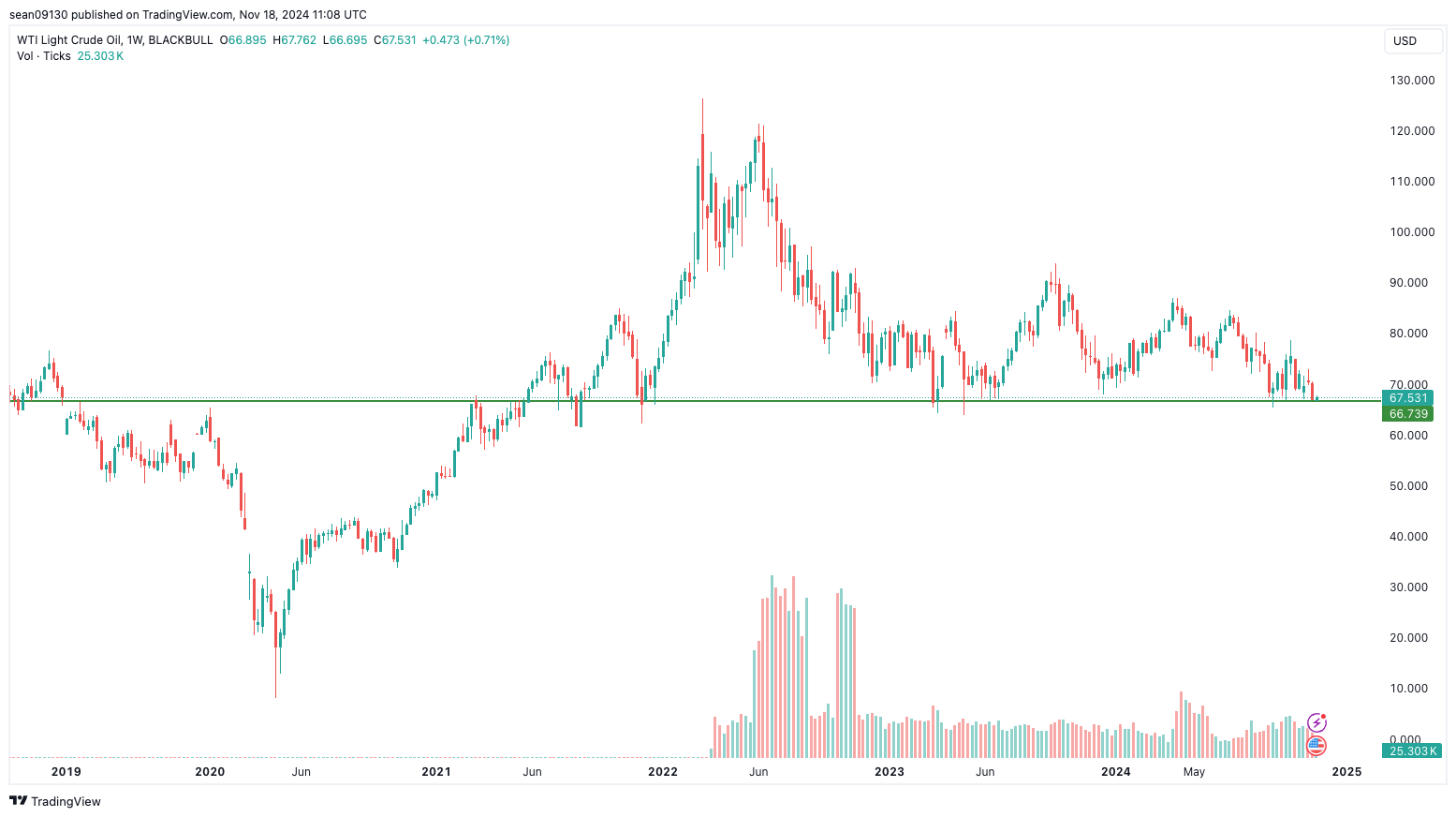
This is WTI crude since 2019. $67.50 has been a crucial support level since 2021. Once WTI falls through that level, we could see a $30 barrel.
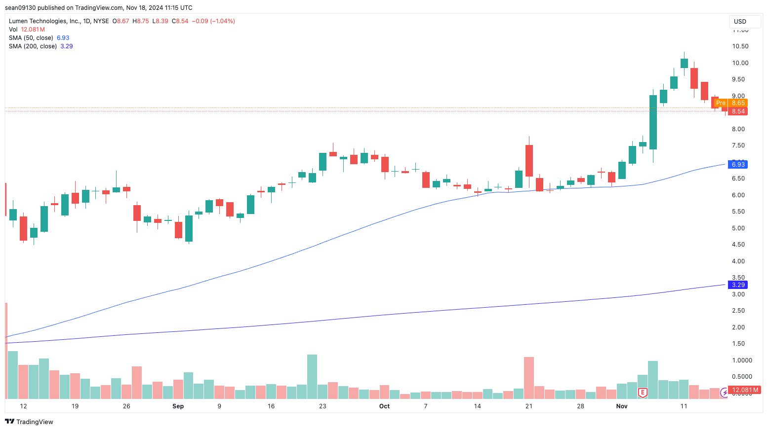
And for this LUMN, notice how the 50-day MA was a dynamic support level from October 14th to November 1st:
Wrap Up
I hope that helps. Please write to feedback@rudeawakening.info with any questions, comments, or issues with today’s edition.
You’ve learned - or relearned - candlesticks, moving averages, and support and resistance levels.
But the best teacher is practice. Start looking at charts with discerning eyes. You’ll develop your ability to spot trends and important levels.
Have a great week ahead!

Models vs. Molecules
Posted April 17, 2026
By Jim Rickards

Watts Over Woke
Posted April 16, 2026
By Matt Badiali

The Woodpecker’s Tongue
Posted April 15, 2026
By Sean Ring

Autocrat Ousted; Congratulates Victorious Opponent
Posted April 14, 2026
By Sean Ring

The World’s Fragile Energy Tapestry
Posted April 13, 2026
By Sean Ring

